Graphing
- Click to view a checklist for completing graphs.
- Click to learn how to graph in Excel.
- Click to learn about interpreting error bars on graphs.
- Click to read a short article about the effective use of graphs.
How do I know which type of graph to use? Follow this key…
1. Is the data a percent that sums to 100% or a total amount of time?
a. If yes .…………………………………Pie chart
b. If no…………………………………....Go to #2
2. Are both your manipulated and responding variables quantitative?
a. If no………………………………….... Bar graph
b. If yes …………………………………. Go to #3
3. Is your manipulated variable levels continuous (i.e. time in years) or clumped into groups (i.e. 0-5 years, 6-10 years)?
a. Continuous…………………………... Scatter plot/line
b. Clumped .....…………………………. Histogram
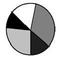
Pie Chart |
Designed to show a percent of a whole, where the whole equals 100%. Pie charts are used to compare data, but cannot be used to see how a manipulated variable affects a responding variable. Pie charts do not show change with respect to another variable.
Ex: Percent of time the cell spends in each phase of the cell cycle |
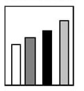
Bar Graph |
Designed to make comparisons of data. The data represented in bar graphs are not necessarily dependent on any other variables and the groupings are usually qualitative (i.e. grouped into categories, like blood types or color). The bars do NOT touch.
Ex: Comparison of the mean reaction rate for five different enzymes |
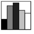
Histogram |
Histograms are similar to bar graphs except the data represented in histogram is usually in groups of continuous numerical (quantitative) data. In this case, the bars do touch. Histograms are often used to show frequency data.
Ex: Minimum Decibels (dBA) of sound heard by 20 people |
Line Graph |
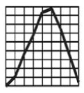
A line graph consists of a series of points plotted on the grid and then connected together point to point by a line. Line graphs are only used when both variables are quantitative. Line graphs show trends, such as how things change over time.
Ex: Average mean temperature between the years 1900 and 2000 |
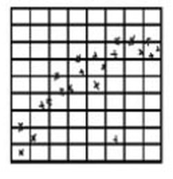
Scatter Plot |
The points are plotted on the grid, but they are not joined point to point. A best fit line may be added to a scatter plot to show a trend. Line graphs are only used when both variables are quantitative. These graphs are useful for showing if a correlation exists between two variables, especially when it is not possible to alter either of the variables (i.e. in descriptive studies).
Ex: Reaction rate at various enzyme concentrations |
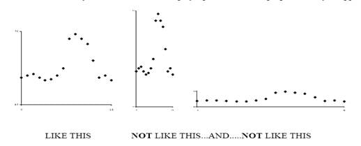
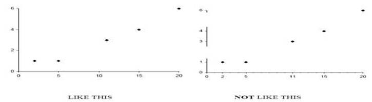
- Mark the quantities on both axes and number them at regular intervals. Your axis intervals do not have to be the same on the x and y axis and they do not have to always start at the origin with a value of 0.
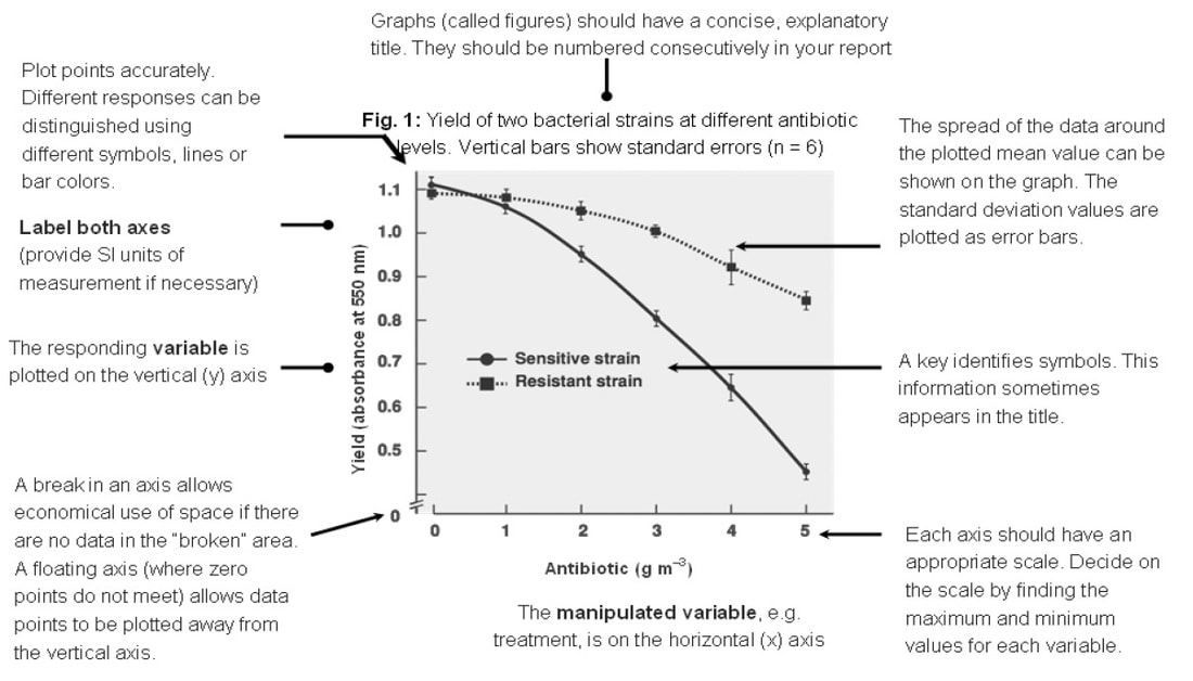
- Giving the graph a title. The graph must have a title which should contain a brief description of what is being investigated. Other information which may go in the title, if available, includes: the date, place and name of experimenter or collector of the data. If there is more than one graph a reference number or letter is required. For example: “Fig 2: A graph showing the change in testis weight throughout the year in the brown rat (Rattus rattus)” IS BETTER THAN... “A graph of testis weight against time” which is insufficient. Underline or use bold type for your title it makes it stand out and is easier to find on the page.
- Plotting more than one graph on a set of axes. Sometimes two or three sets of data (though rarely more) are plotted within the same set of axes. You must distinguish between them by using different symbols (X, Ο, , ∇ etc) or lines (…………., ________, -----------, etc). Use a key by the side of the graph which explains the symbols or lines. Do not write on the graph itself though labels and arrows may be useful. You may wish to plot data from two different responding variables together on one graph but the values may be so different you have to use two different scales. One axis can be placed on each side of the graph.